
Do the logos and visual branding of legal tech companies make a difference to what you think about them? On the eve of Agiloft’s rebranding, Artificial Lawyer takes a look at what might have been with the help of a leading semiotician, and we consider what various brand styles might say about the company.
Let’s start with the real deal. Below is the transformation from the old brand style on the left, to the new brand style on the right.
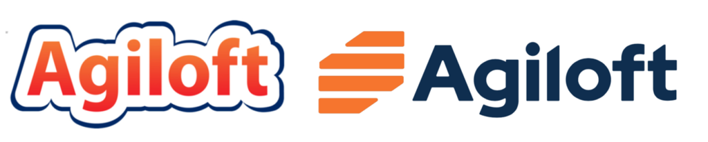
This is what the US-based CLM company had to say about what it means: ‘The new identity is modern and bold, friendly, and relatable and portrays Agiloft’s qualities of agility and empowerment while conveying its benefits and trustworthiness.’
Artificial Lawyer spoke to world famous semiologist and structuralist thinker, Professor Rolando Bartini, about what these signifiers actually might signify, along with his views on a range of alternative brand styles that Agiloft is understood to have considered using*. Take it away Rolando!
—
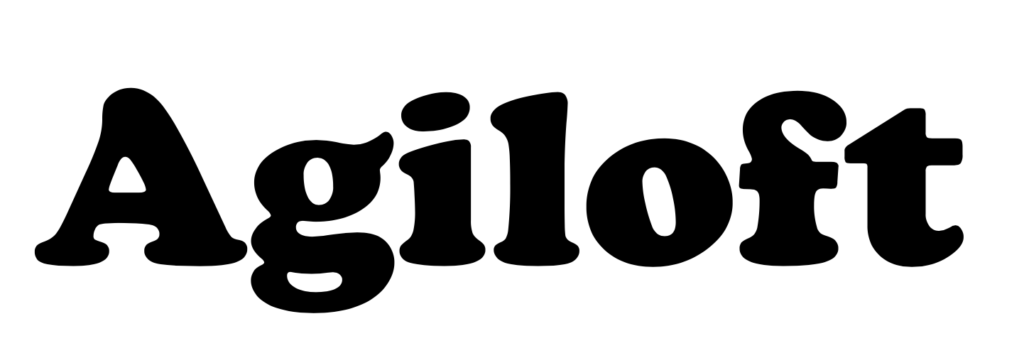
‘Thank-you very much. So, first, I must say that the orangey former brand is very nice. It’s very warm and gives me a pleasant tingly feeling. However, the new brand is much more bold and serious, and the orange stripy thing is also very nice. I like it. It reminds me of slices of cheese and I am a big fan of cheese. So, a success!
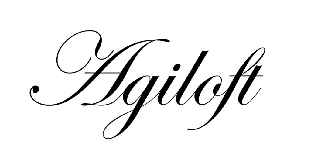
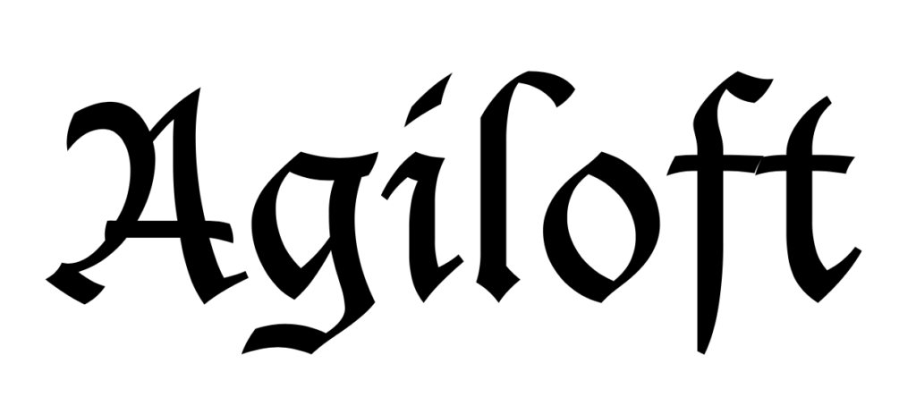
Next, we have several options that I believe Agiloft also considered. This italic one below is also very nice. I imagine a company using this would be very sophisticated, perhaps with an elegant office with chandeliers and mahogany desks, communicating with customers in beautifully written prose.
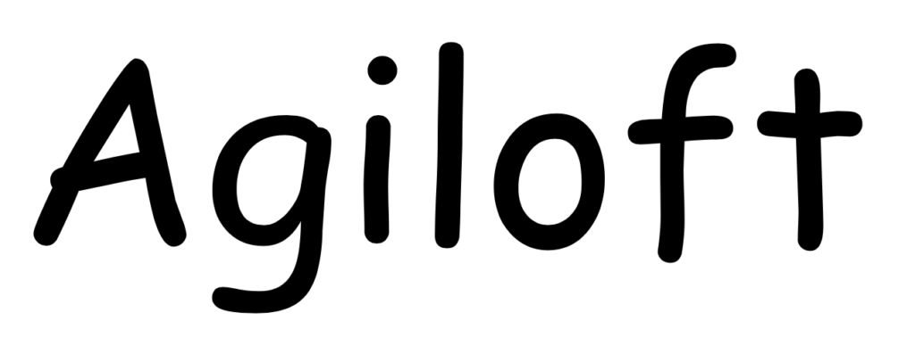
Next we have a very nice alternative brand, which is family friendly. If this company also sold bouncy castles, for example, (and why not…?), this would be a lovely way to communicate a carefree and approachable character for the CLM company. This is a strong second choice for me.
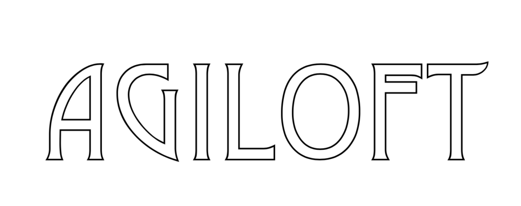
Then we have another elegant one. It is a bit Art Decco, which is nice. But also a bit Tolkein – and that gives me an image of the management team as a group of wizards, smoking pipes and creating magical products. This would also be an excellent choice.
Then we have the 1970s style logo. This is also very nice. It reminds me of flares, Starsky & Hutch, disco music and generally gives a very positive and friendly image of the company. If I was a General Counsel of a large corporation and I saw this branding it would certainly send the right message to me.
Then there is this delightful Medieval style. It gives me the image of the management team of Agiloft getting on their horses, picking up their lances, and charging off to do battle with Ironclad, ContractPodAi and Evisort. It’s quite romantic, and also is a strong contender for second place.
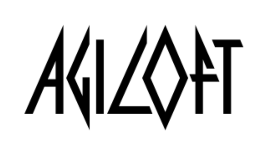
Finally we have the….er….’heavy metal’ style. This reminds me of my youth in Milan. However, the image of big hair, spandex and funny shaped guitars is probably not what Agiloft’s management team is looking for, so this is perhaps not the way to go. Although, it is certainly memorable and helps the company to stand out.
Overall, I think they made a good choice, and the new brand, in my philosophical and scientific opinion, is very nice.’
—
Thank you Professor, your input has been invaluable!
Let Artificial Lawyer know which style you prefer and what it means to you.
—
[ Note – * obviously…not really…..and the old professor also doesn’t really exist either. ]
1 Trackback / Pingback
Comments are closed.