
By Hiro Notaney, VP of Marketing, Agiloft.
Last week, Richard Tromans penned a hilarious piece about the Agiloft rebrand in which he asked if the visual branding of companies make a difference. Obviously, we think it does or we wouldn’t have set out on the journey.
So, Why Rebrand Now?
A company’s visual identity like an individual’s style should reflect what is unique about it. Its personality, its capabilities and its core values. While Agiloft has a rich history we felt the company’s logo and visual identity no longer represented the company it had become. The goal of the project was to honour our rich tradition, but also showcase the new Agiloft.
The New Agiloft
Last year (2021) marked the beginning of a new era at Agiloft. We saw unprecedented growth in sales, expanding our customer count to more than 800. On the product side, we revamped our user interface giving our customers advanced capabilities for automating and integrating complex contract processes. We also launched Agiloft’s Connected Experiences that enables customers to utilise Agiloft CLM as a connected system of record across their organisation using familiar apps like Microsoft Teams, Microsoft Word, Salesforce, and more.
All this led to a number of awards like Contract Management Platform of the Year from the Legal Breakthrough Awards and the Innovation award from the Business Intelligence Group. We were also named CLM market leaders by analyst firms including Gartner, IDC and Spend Matters.
On the employee side, we welcomed more than 100 new employees across the organisation including key leaders in Product, Sales, Finance, Services and Customer Success. One of the new hires was Eric Laughlin who joined as CEO.
He wanted to make sure that as the company scaled, it maintained the qualities that made it such a special place. Part of the project was to capture the ingredients that made up the secret sauce to ensure we did not lose them as we grew. Among the insights we gleaned from the project: customers viewed us as highly trustworthy with strong expertise, but also friendly and approachable. They saw the no-code platform as powerful, flexible and extensible. In other words, agile and empowering.
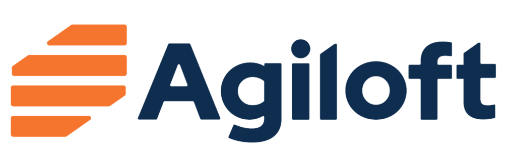
So, how is all this reflected in the new brand? The orange colour represents warmth while the deep blue represents deep expertise. The icon is meant to hint at contracts or documents (not sliced cheese) with the stacked elements evoking building. Rounded corners speak to relatability and the upward angle on the letters suggest positive movement. In short, our new visual identity is bold, friendly, and relatable and demonstrates agility and empowerment.
Here is CEO Eric Laughlin’s take on the new look…
[ Artificial Lawyer is proud to bring you this sponsored article by Agiloft. ]
Discover more from Artificial Lawyer
Subscribe to get the latest posts sent to your email.
Love the new look and the response to the Professor’s article.